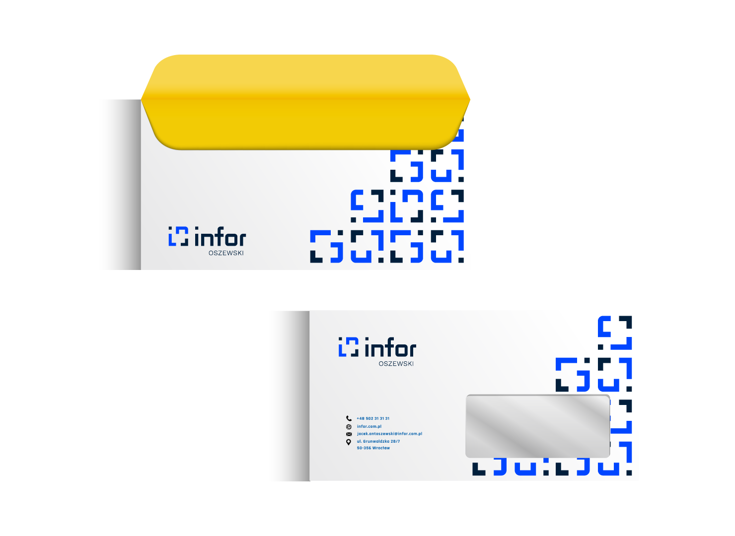
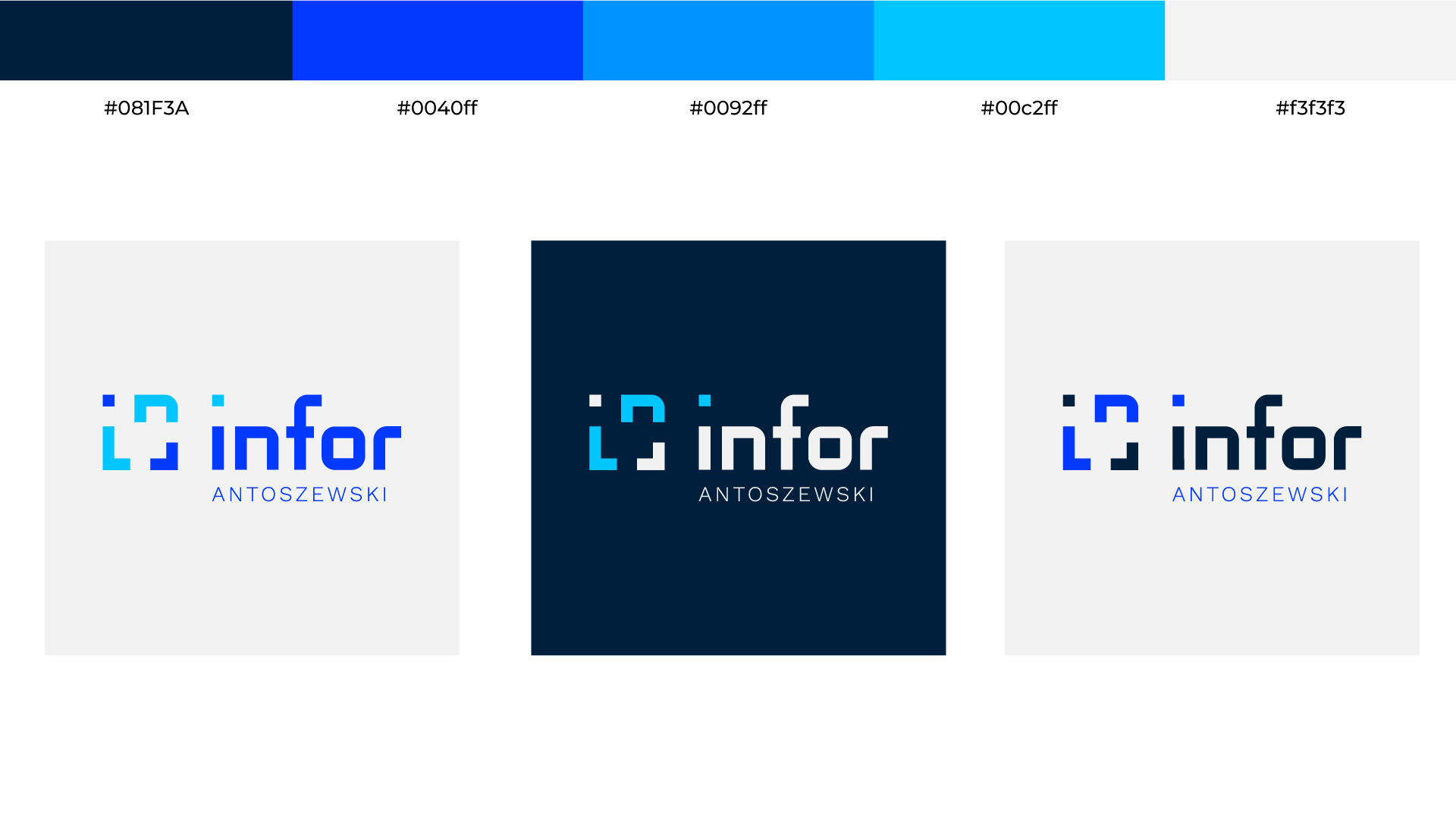
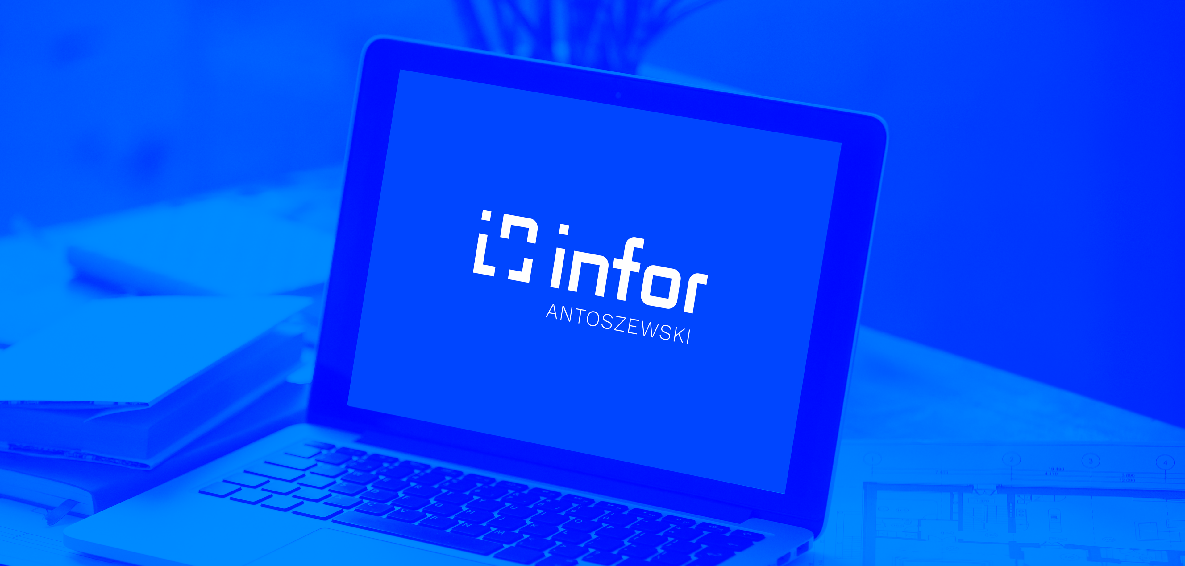
While working on the logo for INFOR, I focused on creating a design that clearly and symbolically reflects the company’s identity in the IT sector, with a specialization in cybersecurity. The main inspiration came from the world of code and technology — this is why the visual form of the logo subtly resembles a graphical code structure, emphasizing its connection to the IT field.

At the heart of the design lies the letters “I” and “N”, carefully integrated into the composition to strengthen brand recognition and uniqueness. The logo was also inspired by the square bracket symbol [ ], a reference to coding and the digital environment in which the company operates. By combining simplicity with modernity, the final mark conveys the dynamic nature of the tech industry while also evoking a sense of security, precision, and innovation.

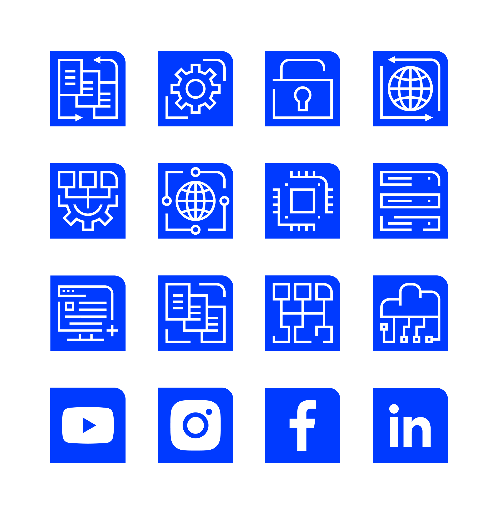
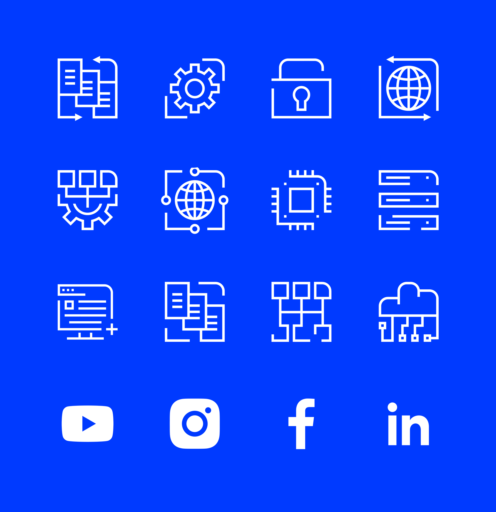
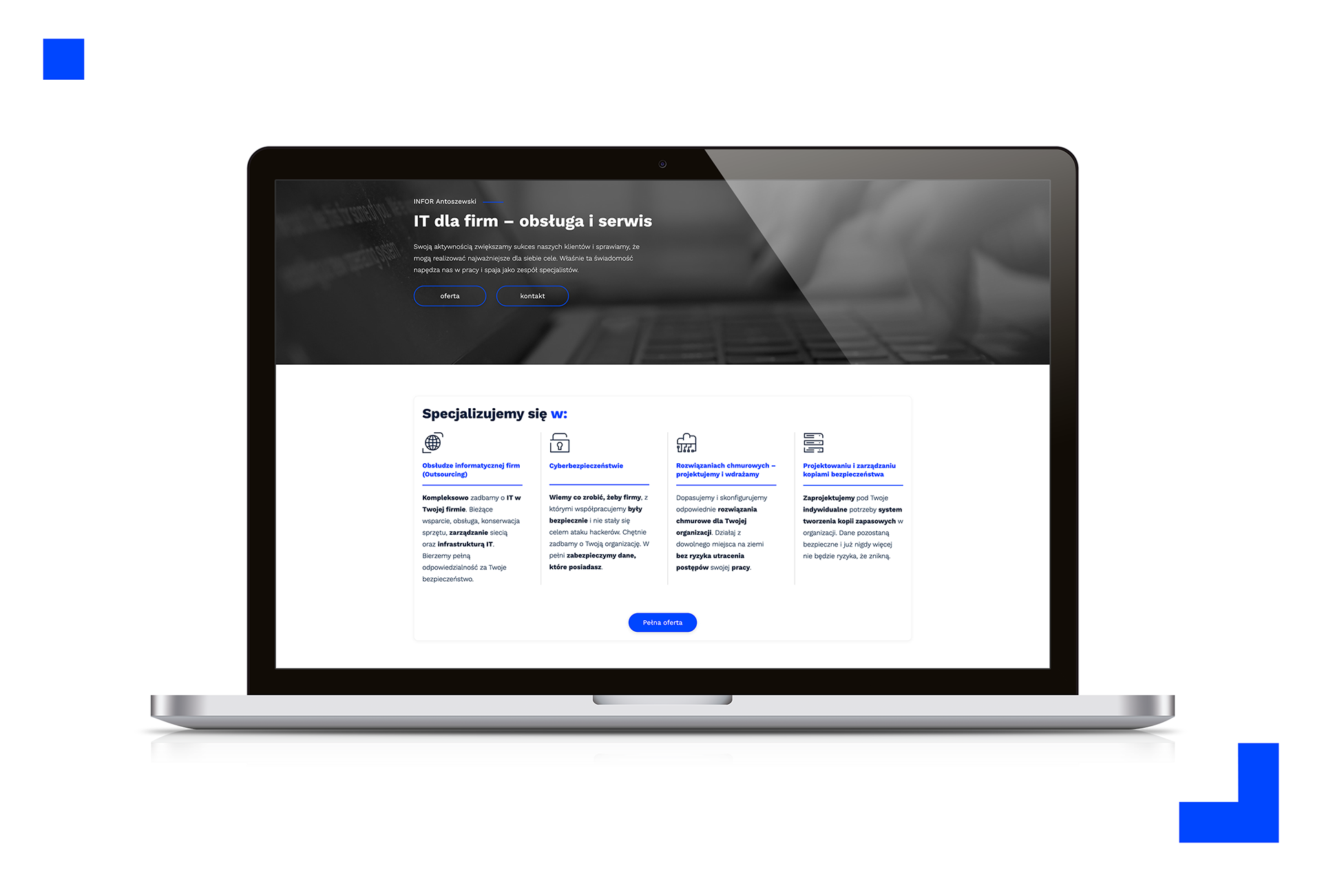
As part of the branding process, I also designed a custom set of icons for Infor’s website, covering various service categories. The icons were created to match the visual language of the logotype, ensuring consistency across the brand’s identity. Their clean, geometric style reflects the company’s focus on clarity, structure, and digital security.
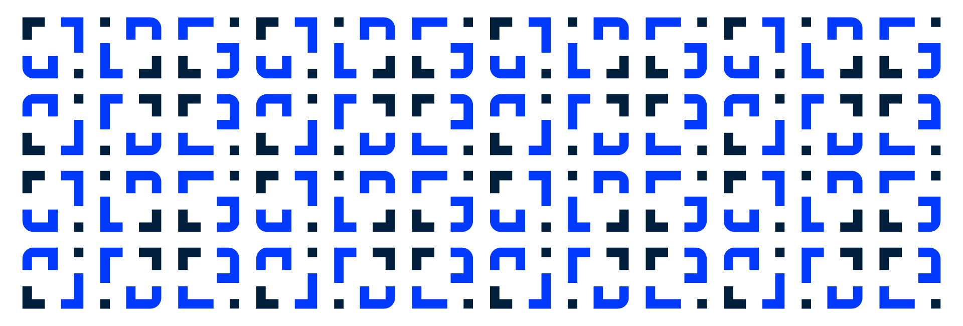
To expand the visual identity, I developed a brand pattern based on the logotype, designed for use across promotional materials. The pattern adds a distinctive and recognizable graphic element that strengthens brand consistency while allowing flexibility in applications such as presentations, merchandise, and marketing collateral.